Full Version: Art in european Shadowrun line
Met recently the european editions of these games and... wow.. the art, at least the cover's , are really cool, definitely more cool than the original amercian counterpart.
And I think they (europeans) got a more serious tone in their art, that I like. While original americans got a more catoony tone, thats present most of the time, even if only in spirit. See for yourself...
Shadowrun: http://www.pegasus.de/1467.html#c1434
By the way, the Unknown Armies line is the same case:
http://www.7emecercle.com/7cv2fr/jdr/ua/ua.html
What you guys think?
Actually, I prefer the US covers. Mostly.
Augmentation? I hate vats with a passion. They're dumb and inefficient in almost every case where a human is involved. The artist could at least have stolen the rigs that get used in Ghost in the Shell SAC instead. Vats, especially the kind in this cover, are everything that is wrong with SciFi.
Unwired? Okay, so this might be an exception. I mean, I don't know why the Hacker's got his shirt off, or why he's got that kind of physique when his job is essentially sedantary, but the art is good and the high contrast environment is nice. The AR is as cool as the stuff on the cover of the US version, but it's far enough away that you don't get any wallbanger effect off the UI. So, yeah. Good going. One of four.
Arsenal? OH GOD WHO THE HELL DREW THAT TRAVESTY ON THE COVER OF THE GERMAN EDITION? Seriously, is this what German people imagine when they try to describe a Street Sam? So we've got an 80's military guy with his hair spiked up in a static pose (with his guns pointing at the ceiling!) standing in front of two bits of geometric art, or something. Those things aren't Drones. Shut up. The man is massively overloaded, too. Imagine how much weight that all is.
Street Magic? The new German cover makes the mage look mildly constipated and retarded. It looks like an amateur 3D render and doesn't show us what the guy is looking at (and he doesn't look scared, so there's really no need to not show it). Expressing head syndrome I can actually deal with (I watch anime, after all), but this just looks bad.
If the cover tries to present itself as an in-universe scene then I prefer it depict events that might actually occur in game (ie people look to be in motion, and aren't posing in an apparent combat situation). SotA '63 has a great cover. Shockwaves (the English PDF I've got) has a cover that just makes me look at it over and over. All of the Shadows of line are good. Survival of the Fittest and Threats 1 are good. Threats 2 manages to put together a multiple scenes all of which have sufficient action that it all works.
Many people these days have watched the higher budget anime series or read well-drawn comics and know what good, fluid drawn action scenes look like. Poseritis is not enough any more.
QUOTE (Heath Robinson @ May 31 2009, 09:07 PM) 
Actually, I prefer the US covers. Mostly.
Seconded. But i actually do like the Street Magic Cover and hate the US Arsenal, but the german one just... while i could imagine the US Cover happen in Shadowrun (maybe a top level fixer showing her goods) the whole vat stuff is just Boobie-Bonus
Links? I am lazy.
QUOTE (Casper @ May 31 2009, 10:33 PM)
Links? I am lazy.
Can be found in the OP.
The French line has the exact same art as the English one.
When the French BBB came out, they just weren't allowed to change it (they wanted to change the cover art).
When the French BBB came out, they just weren't allowed to change it (they wanted to change the cover art).
i actually prefer the european covers myself.
Honestly, none of the covers in either line seem especially inspiring of late. The European covers seem flat, while the North American ones are often cluttered. I haven't had a cover really grab me since Shadows of Europe.
Their Emergence cover is much better than ours.
the euro art is much better IMO. i'm not a fan of the cartoony look in my rpgs.
Yup. I've seen oodles of worse 3d artwork than the augmentation cover back when I helped run a poser forum. But not by people who got paid for it.
I agree with DH that none of the art covers have been fantastic in recent years. I prefer to SR2 and SR3 artwork from the old days, especially the Bergting stuff. That guy rocks 
Why do the European books have different cover art, anyway?
I do admit, the link for the the Emergence cover..I wish that was the cover we got.
But, seriously, why the difference in the looks?
Or, put another way: is it that Europeans can't take teh American art...or is is that they think that Americans could
not handle the European art? Why not use the best of both in future reprints of the american?(Yes, I like the Arsenal cover, but I do not like the U.S. Augmentation cover, because I look at it and find myself inventorying what models, textures, and such I have from that..I mean..they even used the base colours for her "suit"...)
QUOTE (Cardul @ Jun 1 2009, 01:39 PM)
Why do the European books have different cover art, anyway?
[...]
But, seriously, why the difference in the looks?
Or, put another way: is it that Europeans can't take teh American art...or is is that they think that Americans could
not handle the European art?
[...]
But, seriously, why the difference in the looks?
Or, put another way: is it that Europeans can't take teh American art...or is is that they think that Americans could
not handle the European art?
- Arsenal was considered to colorful and comic-like (basically a fallback to SR3's cartoon style that was never popular with German gamers).
- Augmentation was just ugly.
- Same with Emergence.
- Unwired has a nice pic but it doesn't fit the German cover layout*.
- Street Magic had the original US cover when printed by FanPro. Pegasus has not commented on why their re-print has a new cover - might be layout issues again.
* Pegasus' layout has a border running around the cover with a big SR logo on top. This, combined with our different paper size, means a picture designed to cover a full cover with different measurements might not fit.
QUOTE (martindv @ Jun 1 2009, 04:30 AM)
Their Emergence cover is much better than ours.
Bleh, I prefer my Shadowrun free from Goth-crap. It's quite a popular fad over here, though.The guy on Street Magic looks plain retarded. Somehow all of his angles are off, amateur level art.
I would have liked the Arsenal cover back when I was 14. Now... I think I'm getting too old to see that as anything than stupid posing.
But.. what do I care. I avoid translated versions of nearly everything like the plague.
I Think The Guys from Pegasus tried a streamlined Cover Art so it can be easily distuinguished
Arsenal : Ork with Blue Background
Unwired : Troll with Green Background
Augmentation: Elfin with Greyish Background
Streetmagic :Dwarf (Jupp, the Mage is supposed to be a Dwarf) with a Red Background
with a streamlined Background Dance
Medicineman
Arsenal : Ork with Blue Background
Unwired : Troll with Green Background
Augmentation: Elfin with Greyish Background
Streetmagic :Dwarf (Jupp, the Mage is supposed to be a Dwarf) with a Red Background
with a streamlined Background Dance
Medicineman
Yep, that is how I read and understand it, too: the German covers are designed along a certain line, with one central figure (often in the middle of the pic and standing/posing rather nonchalantly) being the core of the art. The German Almanac cover follows the same line.
As for my personal taste: sometimes I like the US versions better, sometimes I prefer the German/European versions. *shrug*:
Arsenal: German (but I would vote for this cover for Arsenal anytime!)
Augmentation: US ("like" may be a strong word here)
Emergence: German!
Street Magic: US!!!!!!!!!
Unwired: US (I like AR! I just lack the soft to do it any better)
Feral Cities: German! (I like the US coversketch, but I absolutely hate the color)
Almanac: German (duh)
If I could make a wish on who should do ALL covers of SR, it would be this guy:
The perfect cover tells a whole story
Presenting: Seattle Sourcebook
Presenting: Runner's Companion
Presenting: Arsenal
Presenting: Attitude
Presenting: Feral Cities
Presenting: Re-Wired
Presenting: War!
And for all those who are totally destroyed by the quality of that art and who think that they can never ever get that good, here's the first pic that same artist put on Deviantart
Whenever I am ashamed by my poor skills, I look at that pic and say: If he could move from this to this in 6 years, then so can I (I hope).
That guy is really good, indeed.
I have seen that "re-wired" pic somewhere else already... just cannot remember where.
The pictures you posted on there are very nice, too. The Traveller cover looks awesome! We'll see what you can do in six years!
Bye
Thanee
I have seen that "re-wired" pic somewhere else already... just cannot remember where.
The pictures you posted on there are very nice, too. The Traveller cover looks awesome! We'll see what you can do in six years!
Bye
Thanee
re-wired looks very much like one of the covers of the original GITS Manga.
It possibly is.
QUOTE (Heath Robinson @ May 31 2009, 02:07 PM)
I mean, I don't know why the Hacker's got his shirt off, or why he's got that kind of physique when his job is essentially sedantary...
He's a troll, that's fat and lazy for trolls

QUOTE (Cardul @ Jun 1 2009, 12:39 PM)
But, seriously, why the difference in the looks?
Different box/cover art for different marketing regions (US/EU/JP) is a totally normal practice in publishing.
QUOTE (Heath Robinson @ May 31 2009, 01:07 PM)
Arsenal? OH GOD WHO THE HELL DREW THAT TRAVESTY ON THE COVER OF THE GERMAN EDITION?
While I agree with you, I still prefer it over the gecko car and walls of U.S. Arsenal. I keep thinking the driver is going to say "Help, I'm stuck to this stupid car!". QUOTE (Stahlseele @ Sep 21 2010, 12:47 PM)
re-wired looks very much like one of the covers of the original GITS Manga.
Well, that can't be it... I do not read Manga/watch Anime.

Most likely someone linked to it in a different topic here or somewhere else.
Bye
Thanee
QUOTE (Heath Robinson @ May 31 2009, 09:07 PM)
Unwired? Okay, so this might be an exception. I mean, I don't know why the Hacker's got his shirt off, or why he's got that kind of physique when his job is essentially sedantary
I have a sedentary job, and I lift weights, and I could be shirtless if it was hot. Not all buff guys are combat monsters or lumberjacks.
QUOTE (Thanee @ Sep 21 2010, 02:38 PM)
Well, that can't be it... I do not read Manga/watch Anime.
Most likely someone linked to it in a different topic here or somewhere else.
Bye
Thanee
Most likely someone linked to it in a different topic here or somewhere else.
Bye
Thanee
You should make an Exception for GITS at least.
I have to agree.
Fraking good!!!
Fraking good!!!
QUOTE (raben-aas @ Sep 21 2010, 03:50 AM)
Yep, that is how I read and understand it, too: the German covers are designed along a certain line, with one central figure (often in the middle of the pic and standing/posing rather nonchalantly) being the core of the art. The German Almanac cover follows the same line.
As for my personal taste: sometimes I like the US versions better, sometimes I prefer the German/European versions. *shrug*:
Arsenal: German (but I would vote for this cover for Arsenal anytime!)
Augmentation: US ("like" may be a strong word here)
Emergence: German!
Street Magic: US!!!!!!!!!
Unwired: US (I like AR! I just lack the soft to do it any better)
Feral Cities: German! (I like the US coversketch, but I absolutely hate the color)
Almanac: German (duh)
If I could make a wish on who should do ALL covers of SR, it would be this guy:
The perfect cover tells a whole story
Presenting: Seattle Sourcebook
Presenting: Runner's Companion
Presenting: Arsenal
Presenting: Attitude
Presenting: Feral Cities
Presenting: Re-Wired
Presenting: War!
And for all those who are totally destroyed by the quality of that art and who think that they can never ever get that good, here's the first pic that same artist put on Deviantart
Whenever I am ashamed by my poor skills, I look at that pic and say: If he could move from this to this in 6 years, then so can I (I hope).
As for my personal taste: sometimes I like the US versions better, sometimes I prefer the German/European versions. *shrug*:
Arsenal: German (but I would vote for this cover for Arsenal anytime!)
Augmentation: US ("like" may be a strong word here)
Emergence: German!
Street Magic: US!!!!!!!!!
Unwired: US (I like AR! I just lack the soft to do it any better)
Feral Cities: German! (I like the US coversketch, but I absolutely hate the color)
Almanac: German (duh)
If I could make a wish on who should do ALL covers of SR, it would be this guy:
The perfect cover tells a whole story
Presenting: Seattle Sourcebook
Presenting: Runner's Companion
Presenting: Arsenal
Presenting: Attitude
Presenting: Feral Cities
Presenting: Re-Wired
Presenting: War!
And for all those who are totally destroyed by the quality of that art and who think that they can never ever get that good, here's the first pic that same artist put on Deviantart
Whenever I am ashamed by my poor skills, I look at that pic and say: If he could move from this to this in 6 years, then so can I (I hope).
Hm. Considering I stole one of the images (the one that everyone's calling very GTS-y; I agree) for my desktop background, I do like the art suggested. However, I gotta disagree about the one for Attitude! - completely wrong. You know why it's wrong? Same reason the real one for Attitude! is wrong - it's trying to put forth an image that would appeal to the shadowrunners in the crowd, and not the mainstream audience of the 2070s. Plus, the official Catalyst one a) looks far too much like Angelina Jolie and b) is trying for a tongue in cheek ironic look, but utterly failing.
First image that comes to mind when I think cover for Attitude? Year of the Comet, the SURGE club. Because that puts forward the weird, alien atmosphere that the 2070s has then (and artwork by Steve Prescott; I mean, c'mon).
Okay, so I'm digging around deviantart for something I'd consider possibly better...
http://fc02.deviantart.net/fs34/i/2008/299...y_theartyst.jpg
Ironic and on topic. As "different" as everyone is in the Sixth World, they're still faceless manequins to the Corps.
http://fc08.deviantart.net/fs71/i/2010/051...peppermintz.jpg
The Sixth World is a weird, wild, technological place. Add some shadowrun looking dudes looking out over it. Though the argument could be made that it's stepping on Shadows of Europe's art toes...
http://fc05.deviantart.net/fs50/f/2009/291..._Rose_Ann95.png
Or if Catalyst wants to stick with the Sixth World advertisement angle, take this, photoshop in some wires and cyber and make her an elf. (I'm in love with this image, personally)
What I'm saying is, Attitude! is supposed to be about the culture of the 70s Sixth World, right? Then why are we aiming for generic "hot chick with gun"? It's a waste of potential.
Wasn't Attitude supposed to be somewhere between gangs and lifestyle?
Ravensmuse is actually totally correct (people with "raven" in their name are by default). I was thinking about "Attitude" in the CP2020 sense of the word at that moment
However, in order to NOT break with the general look and feel with the other SR covers, I would never go to any kind of "candy" look.
So, for Attitude, imagine this one without the guns or that one with a rich corp kid instead (and his ultrasport AV) or that one without the tank, the ruins and the explosives (just kidding).
QUOTE (raben-aas @ Sep 21 2010, 12:28 PM)
So, for Attitude, imagine this one without the guns
If you lose the guns but keep the handcuffs and uniform, I think you've chosen an interesting profession for the cover.
Handcuffs are "bound" to become a major fashion accessory SOMEtime!
QUOTE (raben-aas @ Sep 21 2010, 02:28 PM)
Ravensmuse is actually totally correct (people with "raven" in their name are by default). I was thinking about "Attitude" in the CP2020 sense of the word at that moment
However, in order to NOT break with the general look and feel with the other SR covers, I would never go to any kind of "candy" look.
So, for Attitude, imagine this one without the guns or that one with a rich corp kid instead (and his ultrasport AV) or that one without the tank, the ruins and the explosives (just kidding).
However, in order to NOT break with the general look and feel with the other SR covers, I would never go to any kind of "candy" look.
So, for Attitude, imagine this one without the guns or that one with a rich corp kid instead (and his ultrasport AV) or that one without the tank, the ruins and the explosives (just kidding).
I still love that last one though. Dunno why. Cute girl? Hm. Take it and put all sorts of 'runner graffitti on there, and I think it would be a perfect SR cover, with the appropriate conversions, of course.
I love this artist you keep pulling up raaben. Still too many chicks with guns though (not that this is a bad thing!).
i like the pictures too aas . .
as for you muse . . i find that i will have to . . aquire . . a copy of the movie that was used to produce that video O.o
as for you muse . . i find that i will have to . . aquire . . a copy of the movie that was used to produce that video O.o
Tsukiyaki Western Django. Starring Japanese folk trying to play a Western for all its worth. Quentin Tarantino is both an actor in it, and involved with its production, somehow. Came across it watching that video.
That woman with the gun? Wow. I think she's the next character inspiration.
That woman with the gun? Wow. I think she's the next character inspiration.
i just need my next dose of j-trash after having just watched the machine girl and robo geisha in the last 2 days . .
What on Earth is Vats anyways?
Vats? Good for what ails ya?
Vaultec advanced targeting system.
It's Vats for dinner.
Vats it good for?
The Plural of VAT. These clear tank thingies they had luke skywalker in when he came back from the snowstorm . .
It's Vats for dinner.
Vats it good for?
The Plural of VAT. These clear tank thingies they had luke skywalker in when he came back from the snowstorm . .
QUOTE (Stahlseele @ Sep 21 2010, 04:51 PM)
Vaultec advanced targeting system.
It's Vats for dinner.
Vats it good for?
The Plural of VAT. These clear tank thingies they had luke skywalker in when he came back from the snowstorm . .
It's Vats for dinner.
Vats it good for?
The Plural of VAT. These clear tank thingies they had luke skywalker in when he came back from the snowstorm . .
Yes looks remarkably like a smartlink... or does the Smartlink look like a VATS?
VATS is more like a mix between smartlink2, reflex boosters of a kind and a tactical computer.
And, pretty soon, chips for melee combat!
Nah chips are there for vehicle chase on the interstate highways . .
QUOTE (Thanee @ Sep 21 2010, 12:36 PM)
That guy is really good, indeed.
Oh, he really is, thats why i have many of his pieces saved in my "Shdowrun" art folder.
Especialy good are those neon city covers, too bad the book aren't out in english(as far i could find out)
Here's an interview with him BTW. And yes, he taught himself.
http://psd.tutsplus.com/articles/inspirati...ter-marek-okon/
http://psd.tutsplus.com/articles/inspirati...ter-marek-okon/
Man, he's done some Iron Kingdoms work? Kick ass! I love this guy!
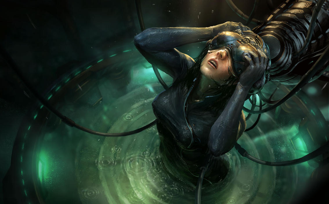
http://fc09.deviantart.net/fs21/f/2007/285...52f7534511d.jpg
I think this is my favorite of his so far. That's a lot of emotion on that girl's face; beautifully presented.
http://fc09.deviantart.net/fs21/f/2007/285...52f7534511d.jpg
I think this is my favorite of his so far. That's a lot of emotion on that girl's face; beautifully presented.
I will say, Raben-AAS is doing some Missions Art for me, and man... I'm loving having him. He's doing some fantastic black and white art. I'm really looking forward to the last couple Season 3 Missions and Season 4, where we'll see a LOT more of his stuff!
Bull
Bull
I like the american art, some of the european is good but the rest is offputting. The amreican is more stylized and action oriented. Emergence just screams run gone wrong.
Arsenal just screams "I have no talent!"
AND he is a TROLL...we should not forget that.^^
This is a "lo-fi" version of our main content. To view the full version with more information, formatting and images, please click here.